Tuesday 28 June 2011

Colours into Tones in Black and White

  For this exercise I have used the coloured filter presets in Lightroom to show the effects of the filters on black and white photographs. I have used the purest colours I could find so that the effects would be as clear as possible.
Original Colour Image
   As you can see from the above image I have included a grey card as a mid-tone so that I can check that the exposure is correct.
Straight Black and White Conversion
    The image above is a straight black and white conversion which has a full range of tones from nearly white to black.
Red Filter
 With a red filter in place you can see that the most obvious change is that the red tomatoes have been lightened considerably, this is because the filter colour used lightens that particular colour and darkens its opposite on the colour wheel. The lemon has also been lightened slightly and has lost some detail.

Yellow Filter
 The yellow filter has lightened the lemon and tomatoes and has darkened the blue denim.

Green Filter
  The green filter used in the image above has had the least effect of all the filters, the tomatoes are ever so slightly lighter as is the lemon and lime.
Blue Filter
   The difference using the blue filter is very dramatic, the tomatoes are glossy jet black, the lemon and lime have both been darkened. The darkening of the lemon has really enhanced the appearance of its texture and whereas in the preceding images it seemed quite flat, in this image it has become dominant.
   I think it would be interesting to try this exercise with a film camera to see if these computer generated images are true to life

Thursday 23 June 2011

Colour Relationships

   We now all generally use colour in our photography without really thinking about it, so it very interesting to make colour the defining element in an image. As it stated in the instructions for this exercise finding the exact colour relationships of Red: Green 1:1, Orange: Blue 1: 2, and Yellow: Violet 1: 3, was not going to be easy without resorting to so manipulation of the elements of the scene. Having said that my first image almost fell into my lap, I was just gazing down on a street scene in London when the green bin lorry just pulled up next to a red bus, a " decisive moment" you might say.

Red/ Green
  As you can see they are in almost the perfect 1: 1 proportion, without the element of the complimentary colours there would be no picture, just imagine if the bus and lorry were brown and blue. The only element that upsets the balance is the green bush in the top left corner, but because of the diagonal nature of the image your eye is drawn to the lorry first and then the bus and your eye is ' satisfied ' there.
   The two below that deal with complimentary colours I had to set up because I just could not find them occurring naturally. The first image is a classic flower against a blue sky, I have used a polariser to deepen the blue of the sky and reduce any reflected light on the flower.

Orange/Blue
  The proportion of blue to orange in this image is not quite right as there is a bit too much blue, it is probably closer to 1: 3, but I felt that the poppy needed some space around it as it is a kind of single point picture.
  The next combination was the most difficult to find because violet is quite a rare colour, it does not appear much in nature and it is not used much commercially, when did you last see a violet car.

Yellow/ Violet
 I set this up by placing the yellow daisy in a pot of lavender and then shooting close at a wide aperture to blur  the lavender, so that the lavender almost swells to fill the frame with colour and your eye is drawn to the daisy as a point of sharpness and difference in colour. The proportions of yellow to violet are pretty much spot on, but the effect is softened slightly by the inclusion of the green between the complimentary colours.
   Now I have dealt with the complimentary colours I want to show some other combinations that appealed to me.
Red/Blue
 I had been looking at these ventilation ducts for some time trying to work out how I could get a picture out of them, when I noticed the man in the red shirt walking towards them, it's just a shame that the other man was not wearing a blue shirt. But I think it is still a nicely balanced composition with diagonal lines zig-zagging through the picture and the slightly larger man nearer to the edge of the frame, although I must admit I cropped it to get these proportions.

Summer Garden, Orange/Violet/Green
  Back to my flowers now I'm afraid, but this image is all about colour, the green is quite recessive so it does not really notice and its the contrast of the orange and violet that comes to the fore. These two colours are in equal proportions and therefore the brightness of the orange is balanced by the richness of the violet.

Poppies, Similar Colours
 This is a lovely fiery combination of two 'hot' colours with just a hint of violet to cool things down a bit, in this image the orange is so bright that the red appears quite recessive. The only problem with this picture is that I would have liked to have lost the red poppy stem as I think it confuses the composition but then the colours became unbalanced.
   So this has been a very informative exercise and certainly has given me some insight into why some of my past images have not worked as well as I had hoped and I look forward to applying this new knowledge in the future, if only I wasn't colour blind.

Saturday 18 June 2011

Primary & Secondary Colours

  For this exercise my first inclination was to head straight for plants and flowers, but as I had pictured these for my second assignment I tried to avoid using them again, but in the end I had to use them for some of the colours. Finding pure colours occurring naturally in the environment takes more time than you would think especially violet.
1/2 a Stop Under Exposed
Normal Exposure


1/2 a Stop Over Exposed

  I found abandoned trailer at the side of the A12 in Essex, it had been used as a cafe in the past, so it has a certain amount of local historical interest. Out of the three pictures the one that is under exposed is closest to the blue in the colour circle, blue subjects were quite hard to find unless you used the sky or reflections of the sky.
1/2 a Stop Under Exposed
Normal Exposure
1/2 A Stop Over Exposed
  I found this complete field of poppies growing where the farmer had left his field fallow for several years, it was a great sight. I have found that if I over expose red subjects that I tend to lose detail in the brighter areas, out of these three picture the under exposed one is once again the nearest to the red in the circle.

1/2 a Stop Under Exposed
Normal Exposure
1/2 a Stop Over Exposed
   Because yellow is the brightest of the colours the cameras' meter will tend to under expose it as it is lighter than a mid tone. Therefore the over exposed one of these three images is closest to a true yellow, the under exposed image is too dark to be a true yellow.

1/2 a Stop Under Exposed
Normal Exposure
1/2 a Stop Over Exposed
  Violet is the rarest of the colours to find, I could only really find it in its true form in flowers, out of these three, once again the under exposed image is the closest to the colour circle.

1/2 a Stop Under Exposed
Normal Exposure
1/2 a Stop Over Exposed
   This grass was very well watered and was therefore a very bright green, the closest to its true state is the normal exposure, but the closest to the colour circle is once again the under exposed one. I normally use grass as a mid tone if I need a reference whilst photographing.

1/2 a Stop Under Exposed 
Normal Exposure
1/2 a Stop Over Exposed
  Because orange is a mixture of red and yellow, it appears to need a lighter exposure to match the colour circle, I think that the the normal exposure is the closest match, although I prefer the brightness of the over exposed image.
  This has been an interesting and surprisingly tricky exercise and I feel quite disheartened that I had to resort to flowers again to complete it.


Friday 10 June 2011

Control the strength of a colour

 This was a fairly straight forward exercise to see how altering the exposure of a subject will affect its colour. I chose my own front door as it is a good strong colour, so any changes should be obvious.

No Exposure Compensation
    The image above is with no compensation and the colour is quite strong but slightly lighter than the actual door.

Under Exposed by 1/2 Stop
  This image is much closer to the true door colour, it under exposed by 1/2 a stop and the colour appears deeper.
Under Exposed by 1 Stop
   This image is under exposed by 1 stop, the red now appears darker and more saturated than the actual door, although in effect it is only the brightness of the image that has changed, the saturation of the image cannot be changed by changing the exposure alone.

Over Exposed by 1/2  Stop
   The picture above is over exposed by 1/2 a stop, the colour is starting to appear washed out and has no real depth, it has brought out more of an orange tone.

Over Exposed by 1 Stop
  This image is over exposed by 1 stop and is so washed out it bears almost resemblance to the original door, I can't believe that it is only the brightness of the colour that has changed and not the saturation.
  The second image where the door was under exposed by 1/2 a stop is the closest to its true colour, this would be because the door is darker than a mid tone so the cameras meter would over expose.
  I think that under exposing to create the impression of a stronger colour is definitely a technique that I will utilise in the future.

Friday 3 June 2011

Street Photographs

  The photographs that follow are not a part of the course but I have been having a go a some street photography over the last few months and I wanted to share my favourites.
Trafalgar Square


     I hope you enjoyed them.


Thursday 2 June 2011

Assignment 2, Elements of Design

For this assignment I chose the plants and flowers option as I had some previous experience with this type of photography and I wanted to see how applying the compositional rules would affect my approach. I have tried to vary the type of images I produced by taking still life and environmental photographs.
    Most of the way we now look at photographing natural forms we owe to Edward Weston (1886-1958), he shunned the former pictorialist fashion, of a more painterly approach to photography, and allowed natural light to show natural forms, such as vegetables and shells, in a true and uncompromising way. He was a consummate technician and used his considerable skill to create " a vision of sheer aesthetic form" Weston cited Pitts,T (2008), most of us now follow his way of working, even if we have never heard of him. We would not normally photograph a natural form in an unnatural way, unless it was for a special purpose, Westons' beautifully lit Nautilus Shell (1927) and Pepper No.30 (1930) photographs are still the pinnacle of natural photography for many. So although I do not feel that any of my submissions for this assignment are particularly Westoneque, I do feel that his way of working underpins much of my own work process, " I want the stark beauty that a lens can so exactly render"( Weston cited Pitts, T 2008).
   My first couple of images are influenced by another photographer with natural forms, in the shape of male nudes and also flowers, and that is Robert Mapplethorpe (1946-1989).
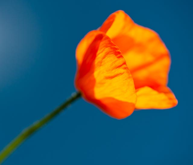
Single point
  The poppy above was captured in my garden just as the sun was rising, the light striking the flower from behind and leaving the flowerbed behind in darkness. Mapplethorpe used a similar treatment in his flower images, using backlighting on a thin papery poppy in his Poppy (1988) and generally keeping his flower subjects quite small in the frame, although all the flower studies of his, that I have seen, have been studio based.(Levas,D.1990)
  Another favourite flower of Mapplethorpes was the Orchid and that was my next choice.

Curves
   Mapplethorpe was known for his almost sexual images of flower especially, his Jack in the Pulpit (1988) and the many Orchid photographs he made throughout the 1980's. I think you can see why he chose the Orchid, it is just full of curves and open for all to see.
Vertical and Horizontal Lines
Diagonal Lines
   The two photographs above show the influence of a third photographer, Karl Blossfeldt (1865-1932), who was a lecturer at the Museum of Applied Arts in Berlin,he took his greatly magnified photographs of plants so that his students could copy their natural forms in sculpture.( Badger,G.2007)  Like Weston, Blossfeldt aspired to clear, sharp images of natural forms, but unlike Weston he was not adverse to tweaking the plants first. He would quite happily cut off a leaf he did not like. Also whereas Weston was trying to produce a work of art, nothing was further from Blossfeldts mind and he was amazed when his book Art Forms in Nature (1928) was widely acclaimed by the art establishment.
     The picture of the fern above is typical Blossfeldt, although mine is lit from behind on a lightbox, a plant structure on a plain background.
     The image of the grassheads is inspired by Blossfeldts graphically compelling pictures of Two-rowed barley(1928), although I have obviously tried to make it even more strikingly graphic. ( Adam,H,C. 2008)
    Strangely enough after taking the picture of the grassheads for the diagonal lines part of the assignment I felt distinctly uncomfortable, in picking the grass and laying it out in a pattern, a la Blossfeldt, I had gone against the Weston in me, so I took another more natural diagonal picture, below.
Diagonal Lines again
  I feel more comfortable with this image, no messing about, no contrivance, maybe it worked for Blossfeldt because he was not trying to produce arty.
Two Points
Several points
   The two images above are more naturalistic, I wanted to find the 'points' pictures occurring naturally, finding one point, fairly straightforward, two points, not too bad, finding multiple points and still ending up with a balanced picture, not so easy. But being difficult it made me really look at plants in a different way, instead of looking at a single bloom I started to look at combinations and how they react within the frame, teaching me to " really see" ( Strand,P cited by Badger,G 2007). I Particularly like the poppy picture because the mass of vegetation of the right is balanced by the single delicate bloom on the left.
Shape
Shape
   The two shape photographs are fairly straightforward  indoor shots, taken indoors to make sure there was no movement to blur the details. The Anenome centre immediately above is a fairly stable image, being round the eye does not leave the frame, whereas the Cornflower above it has a nice interesting star shape with the diagonal needle like leaves leading the eye off to the edge of the frame and back.

Implied Triangle
   Above is the first of my implied triangle images and it brings me back to the work of Edward Weston, especially the pictures he made around Point Lobos in the 1930's. At that time he was greatly interested in the patterns made by tree roots, rocks and all kinds of naturally occurring subjects. If I had not been looking for a triangle I would not have taken this picture but I feel it has a certain creepy quality that I cannot quite put my finger on.
Implied Triangle
  This picture is made up of several triangles made by the tree branches, one of the branches also leads your eye across the frame to the hole through the plants on the right side, giving you a window through the picture. The light is coming from behind the tree giving a translucence to the leaves and flowers.

Implied Triangle
    The picture of Alliums above is the kind of picture I might have taken before but the addition of the triangular formation is not something I would have thought of applying and I feel it makes the image. Without the Allium on the left at the back the picture would be unbalanced and the three Alliums in a row would lead your eye off of the image.

Pattern
   The pattern made by the Chrysanthemums above has just the right amount of irregularity to keep it interesting, if the pattern was perfect it be less appealing .( Freeman, M. 2007) I have added as much contrast as possible to emphasize the pattern.

Rhythm
   Finding rhythm among plants was more difficult than I thought, plants tend to grow around rather than along. The Hyacinths above have several rhythms, one runs up and down the leaves and the main one running across the picture loops along the bottom of the blooms.
  I have found the application these different compositional rules very illuminating and the rigor of having to apply them to my images has definitely changed the way I look at possible subjects. Before if I was taking a plant portrait I would have zoomed in close, blurred the background and that would have been it, job done. Hopefully I will be able to keep these compositional pointers in mind in the heat of the moment in the future.

   Ref : Pitts,T,2008, Edward Weston,Taschen, Cologne.
           Levas,D,1990, Flowers Mapplethorpe,Bullfinch,Boston,New York,London.
           Badger,G,2007, The Genius of Photography,Quadrille,London.
           Adam,H,C,2008,Karl Blossfeldt The Complete Published Works,Taschen,Cologne.
           Freeman,M 2007,The Photographers Eye,ILEX,Lewes