We now all generally use colour in our photography without really thinking about it, so it very interesting to make colour the defining element in an image. As it stated in the instructions for this exercise finding the exact colour relationships of Red: Green 1:1, Orange: Blue 1: 2, and Yellow: Violet 1: 3, was not going to be easy without resorting to so manipulation of the elements of the scene. Having said that my first image almost fell into my lap, I was just gazing down on a street scene in London when the green bin lorry just pulled up next to a red bus, a " decisive moment" you might say.
 |
| Red/ Green |
As you can see they are in almost the perfect 1: 1 proportion, without the element of the complimentary colours there would be no picture, just imagine if the bus and lorry were brown and blue. The only element that upsets the balance is the green bush in the top left corner, but because of the diagonal nature of the image your eye is drawn to the lorry first and then the bus and your eye is ' satisfied ' there.
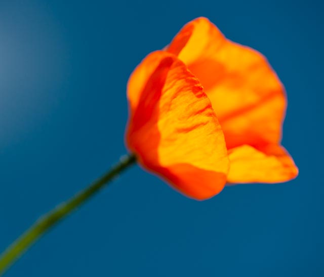
The two below that deal with complimentary colours I had to set up because I just could not find them occurring naturally. The first image is a classic flower against a blue sky, I have used a polariser to deepen the blue of the sky and reduce any reflected light on the flower.
 |
| Orange/Blue |
The proportion of blue to orange in this image is not quite right as there is a bit too much blue, it is probably closer to 1: 3, but I felt that the poppy needed some space around it as it is a kind of single point picture.
The next combination was the most difficult to find because violet is quite a rare colour, it does not appear much in nature and it is not used much commercially, when did you last see a violet car.
 |
| Yellow/ Violet |
I set this up by placing the yellow daisy in a pot of lavender and then shooting close at a wide aperture to blur the lavender, so that the lavender almost swells to fill the frame with colour and your eye is drawn to the daisy as a point of sharpness and difference in colour. The proportions of yellow to violet are pretty much spot on, but the effect is softened slightly by the inclusion of the green between the complimentary colours.
Now I have dealt with the complimentary colours I want to show some other combinations that appealed to me.
 |
| Red/Blue |
I had been looking at these ventilation ducts for some time trying to work out how I could get a picture out of them, when I noticed the man in the red shirt walking towards them, it's just a shame that the other man was not wearing a blue shirt. But I think it is still a nicely balanced composition with diagonal lines zig-zagging through the picture and the slightly larger man nearer to the edge of the frame, although I must admit I cropped it to get these proportions.
 |
| Summer Garden, Orange/Violet/Green |
Back to my flowers now I'm afraid, but this image is all about colour, the green is quite recessive so it does not really notice and its the contrast of the orange and violet that comes to the fore. These two colours are in equal proportions and therefore the brightness of the orange is balanced by the richness of the violet.
 |
| Poppies, Similar Colours |
This is a lovely fiery combination of two 'hot' colours with just a hint of violet to cool things down a bit, in this image the orange is so bright that the red appears quite recessive. The only problem with this picture is that I would have liked to have lost the red poppy stem as I think it confuses the composition but then the colours became unbalanced.
So this has been a very informative exercise and certainly has given me some insight into why some of my past images have not worked as well as I had hoped and I look forward to applying this new knowledge in the future, if only I wasn't colour blind.


No comments:
Post a Comment